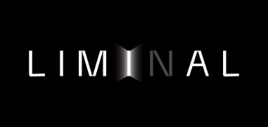
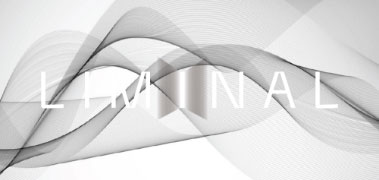
The LIMINAL logo embodies augmentation and speed in the spirit of being thrusted into a virtual space. The light emitted from the “I” motions the audience to enter a new era of entertainment — the metaverse.
Our brand promise of “THE METAVERSE ENTERTAINMENT COMPANY”, is something that we proudly carry as proof of our way of operating the brand.
Its role is to reinforce and support the position of the brand identity and should never be used without the brand’s logo presence.
Logo + Tagline Measurement
Our measurement is taken from of our logo’s x-height. The logo, dash and tagline are vertically center-aligned.
It provides a universal and proportional measurement system for our logo.
x = height of logo
Clear Space
Our clear space is designed in order to ensure that our legibility is never obstructed by other design elements. The clear space is always X.
Please do not obstruct our clear space in order to ensure legibility across all production materials.
x = height of logo
Minimum Size
This is the minimum size for our logo for both print and digital.
Please ensure that our logo is never used below these sizes to ensure legibility.
The width of the logo cannot be smaller than 85px.
Logo on colour/background
These are the proper usage of the logo on different backgrounds.
Please ensure that our logo is always legible when using on the various background visuals.
On black background
On white background
On coloured background
On Dark Picture
On Light Picture
Common mistakes
These are examples that illustrate many common mistakes to avoid. Mistakes that interfere with logo visibility should be avoided to ensure the effectiveness in presenting the brand.
Do not change the component of the logo in
any way.
Do not distort or rotate the logo in any way.
Do not combine the logo with other text or artwork.
Do not add any elements to the logo in any way.
Do not place the logo on complicated or similar coloured background.
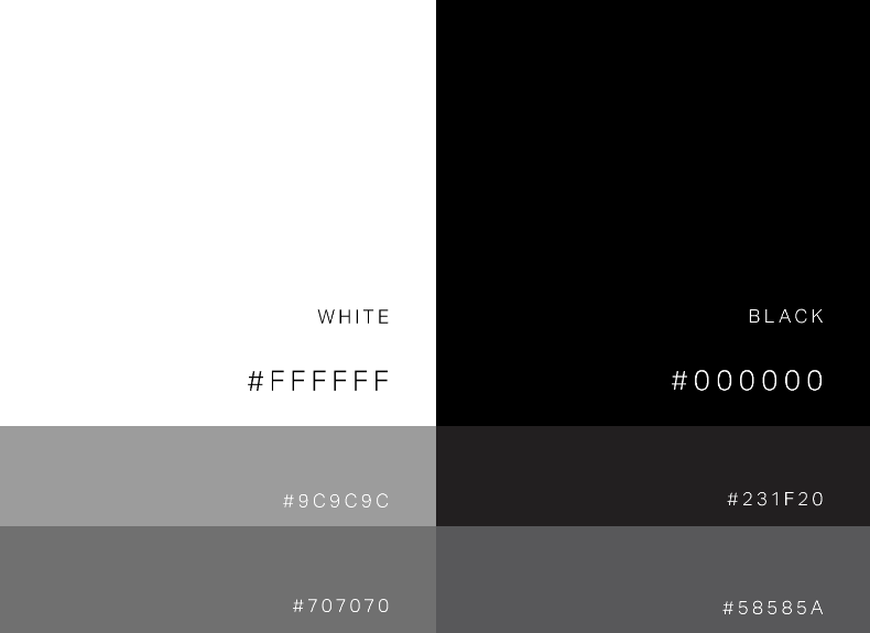
Colour
Primary colours
These are our main colours; it should be used in all collaterals, such as: social media, website, and printed media.
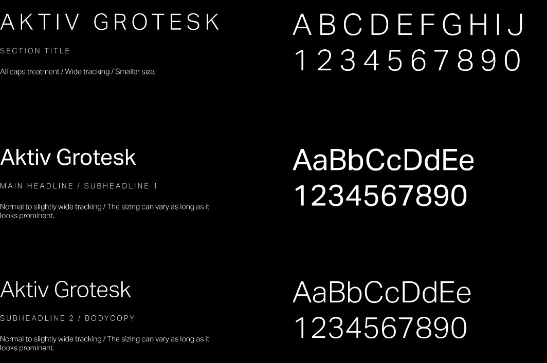
Typography
Primary typeface
Aktiv Grotesk can be subscribed at adobefonts.com
Section Title
Weight Used
Aktiv Grotesk Light
Function
Display
Display typeface means that this type is only used for bigger visual hooks such as headlines, titles and quotes.
Main headline / bodycopy
Weight Used
Aktiv Grotesk Regular
Function
Display
Display typeface means that this type is only used for bigger visual hooks such as headlines, titles and quotes.